Flow Messages
Flow messages
The Chat Widget supports Markdown out of the box, meaning any text that is sent to flow can be sent as Markdown and will be handled automatically with no additional setup.
Flow can send the following messages to the widget:
Text message
{"type": "message", "payload": "What is your order number?" }
You can add line breaks to messages by using \n characters:
{"type": "message", "payload": "What is your order number\nOr email address?" }
Some markdown elements, like lists and headings, require the syntax to be broken on to new lines. To achieve this in a flow message it is necessary to add newline characters to the message to create the line breaks:
{"type": "message", "payload": "- one\n - two\n - three\n" }
Text messages also support an enableFeedback property, which when true, will add thumbs up / down buttons alongside the message to gather feedback from the end user.
{"type": "message", "payload": "A helpful message", enableFeedback: true }
Quick replies
{
  "type": "quickReply",
  "payload": [
    {
      "id": 1,
      "text": "content",
      "hyperlink": "http://somewebsite.com"
    },
    {
      "id": 2,
      "text": "content",
      "returnToMainMenu": true
    },
    {
      "id": 3,
      "text": "content",
      "quickReplyClassname": "content"
    }
  ]
}
Properties
id- The unique ID of the quick reply.hyperlink- (optional) If provided, the quick reply will open the provided link in a new tab.returnToMainMenu- (optional) When true, the quick reply will execute flow from the beginning when selected.quickReplyClassname- (optional) Adds a custom classname to the quick reply button.
Carousel
{
  "type": "carousel",
  "slideOrientation": "horizontal",
  "carouselType": "product-carousel",
  "payload": [
    {
      "id": 1,
      "trackingId": "apple",
      "image": "https://picsum.photos/200/300",
      "title": "Apple",
      "description": "Apple slide",
      "externalLink": "http://google.com",
      "price": "£10",
      "secondaryButton": {
        "text": "Add to cart",
        "callbackName": "onAddToCart",
        "disabled": false,
      },
      "variants": [
        { "id": 8, "name": "Red apple", "image": "", "price": "£1", "externalLink": "http://google.com", "trackingId": "a"},
        { "id": 9, "name": "Green apple", "image": "", "price": "£2", "externalLink": "http://google.com", "trackingId": "b" },
      ]
    }
  ]
}
Properties
slideOrientation - defines the ratio used to display carousel's slides. Can be one of 'square' | 'horizontal' | 'vertical', square by default.
payload - An array of objects, each object represents a slide in the carousel.
id- The unique id of the product.trackingId- (optional) Used for analytics purposes.image- An image of the product. This is not required ifvariantsare provided.title- The title/name of the product, supports markdown.description- A short description of the product, supports markdown.price- (optional) Displays the product price in a 'pill' on top of the image. This is overriden by the selected variant price. Supports markdown.externalLink- (optional) Opens the provided link in a new tab when the product is selected.buttonText- (optional) The text displayed in the 'Buy' button.disableButton- (optional) When true, disables the button, preventing any interaction.variants- When provided, each product/slide will display a thumbnail per variant. When a variant is selected, it's data takes precedence over top level data e.g. the variantsexternalLink,trackingIdandpricewill be used when a product is selected.secondaryButton- (optional) An object containing properties for displaying a second buttontext- The text of the secondary buttoncallbackName- The name of a custom callback defined incallbacks, called when the secondary button is selected.externalLink- (optional) Opens the provided link in a new tab when the product is selected.disabled- (optional) When true, disables the button, preventing any interaction.
CSAT Request
Instructs the widget to initiate CSAT.
{"type": "sendCSATRequest"}
Attachments
{"type": "attachment", "payload": { "url": "https://url-to-image.here.extension" }}
Prefix message
Each message type may contain prefixMessage property.
The prefix message will be displayed as regular message from bot.
The rest of the message content based on message type will be rendered after that "prefix".
{
    "type": "quickReply",
    "prefixMessage": "Hi, how can i help you?",
    "payload": [
        { "id": 1, "text": "content" },
        { "id": 2, "text": "content" },
        { "id": 3, "text": "content" }
  ]}
Disable/Hide Chat Input
Each message, of any type, can be disabled or hidden by sending a flag in the message. To disable the input disableChatInput: true should be sent. To hide the input hideChatInput: true should be sent. When the next message arrives, if the disableChatInput/hideChatinput flags are not present then the widget will re-display/re-enable the input:
{"type": "sendCSATRequest", "disableChatInput": true }
{"type": "message", "payload": "what is your order number?", "hideChatInput": true }
Batch Messages
A batch message can be used to send multiple messages in the same request. These will appear in order one after the other. Supported messages include TextMessages, QuickReplies, Carousels and the Select dropdowns. All are shown above.
{
  "type": "batch",
  "prefixMessage": "My prefix message here",
  "payload": [
    { "type": "message", "payload": "Hello" },
    {
      "type": "select",
      "payload": {
        "title": "Select an option",
        "options": ["Option one", "Option two"]
      }
    },
    {
      "type": "quickReply",
      "payload": [
        {
          "id": 1,
          "text": "content",
          "hyperlink": "http://somewebsite.com"
        },
        {
          "id": 2,
          "text": "content",
          "returnToMainMenu": true
        },
        {
          "id": 3,
          "text": "content",
          "quickReplyClassname": "content"
        }
      ]
    }
  ]
}
Forms
Forms should be utilised when information needs to be collected from the user. The below example is a simple form that asks the user for an order ID.
{
   "type": "form",
   "payload": {
     "closeFormMessage": "Ask about something else",
     "closeButtonEnabled": true,
     "fields": [{
       "name": "ordernumber",
       "label": "Order Number",
       "type": "text",
       "placeholder": "r123456789",
       "validation": {
        "required": {
            "value": true,
            "message": "required"
          },
        "pattern": {
          "value": "^r[0-9]{9}$",
          "message": "Please provide a valid order number"
        },
        "maxLength": {
          "value": 10,
          "message": "The order number is too long"
        }
      }
    }]
  }
}
Properties
closeFormMessage- (optional) If provided, displays text in the form popup, which closes the form when clicked and resumes flow.closeButtonEnabled- When true, an 'X' icon is displayed in the form popup, which closes the form when clicked and resumes flow.fields- An array of fields to display in the form.name- The name of the field, used as the key of the property of the submitted form data.label- The field input label.type- The type of the input e.g.text|textarea|number.placeholder- The input placeholder text.validation- Enables validation constraints to be applied to the field. Ensure any validation has a usefulmessageto inform the user why the input is invalid. See theValidationsection below.
Validation
The widget aligns with the existing HTML standards for form validation. Fields can be validated using the following constraints:
required
A Boolean which, if true, indicates that the input must have a value before the form can be submitted.
 "required": {
  "value": true,
  "message": "required"
},
maxLength
The maximum length of the value to accept for this input.
 "maxLength": {
  "value": 10,
  "message": "The order number is too long"
},
minLength
The minimum length of the value to accept for this input.
 "minLength": {
  "value": 5,
  "message": "The order number is too short"
},
max
The maximum numerical value to accept for this input.
 "minLength": {
  "max": 10,
  "message": "This number is too big"
},
min
The minimum numerical value to accept for this input.
 "minLength": {
  "max": 1,
  "message": "This number is too small"
},
pattern
Validate the field using a regular expression. The regex string must be a valid JSON string. Check that your regex is a valid JSON string by validating it using a JSON validator.
 "pattern": {
  "value": "^r[0-9]{9}$",
  "message": "Please provide a valid order number"
},
Lists
Display a list of items in a popup, for example a list of reasons for return:
{
  "type": "list",
  "payload": {
      "title": "Reason for return",
      "description": "GIVENCHY Black Box Chain Minidress IT 38",
      "closeButtonEnabled": true,
      "closeMessage": "Ask something else",
      "multiSelectEnabled": true,
      "options": [
          {
              "id": "Does not fit properly",
              "text": "Does not fit properly"
          },
          {
              "id": "Order more than one size",
              "text": "Order more than one size"
          },
      ]
  },
  "prefixMessage": "Select an option"
}
Properties
title- (optional) The title of the list.description- (optional) A description of list.closeButtonEnabled- When true, an 'X' icon is displayed in the popup, which closes the popup when clicked and resumes flow.multiSelectEnabled- (optional) When true, multiple list items can be selected.closeMessage- (optional) If provided, displays text in the form popup, which closes the popup when clicked and resumes flow.options- An array of options.id- The unique id of the option.text- The text/label of the list item.
Crm Handover
Send an instruction from DigitalGenius Flow to the chat widget to trigger a handover to a supported crm.
Salesforce
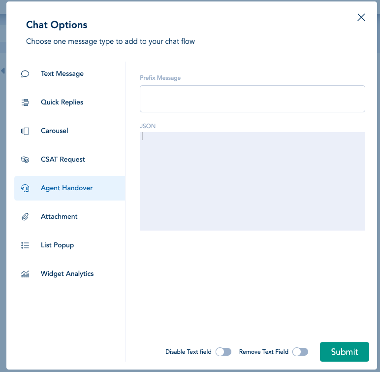
In order to trigger a handover from the DigitalGenius Bot to an agent on Salesforce use the Agent Handover chat activity in Flow:
The payload for the JSON input must follow the following format:
{
  "type": "crmHandover",
  "buttonId": 123456789, // REQUIRED
  "deploymentId": 123456789, // REQUIRED
  "organizationId": 123456789, // REQUIRED
  "caseId": "5706g000004HryEAAS",
  "customFields": [{
    "label": "region",
    "value": "London",
    "transcriptFields": [],
    "displayToAgent": true,
  }]
}
The buttonId, deploymentId and organizationId and deploymentId can be found in the Salesforce UI. See the docs here for details: https://developer.salesforce.com/docs/atlas.en-us.service_sdk_ios.meta/service_sdk_ios/live_agent_cloud_setup_get_settings.htm
Optionally a caseId can be passed to reference a specific case and customFields can also be passed to pass custom data to Salesforce. Custom fields must be in the format of Salesforce CustomDetail objects as documented here: <https://developer.salesforce.com/docs/atlas.en-us.live_agent_rest.meta/live_agent_rest/live_agent_rest_data_types.htm#CustomDetail
Zendesk
Zendesk can optionally be passed an array or tags and a departmentId which specifies which department the chat should be handed over to in Zendesk
{
  "type": "crmHandover",
  "tags": ["abc1", "123"],
  "departmentId": 123456789
}
Sunco
Zendesk can optionally be passed tags and a groupId which specifies which group the chat should be handed over to in Sunco
{
  "type": "crmHandover",
  "groupId": 123456789,
  "tags": "tag1, tag2"
}
Oracle
queueId, contactId and incidentId are all required for handover to Oracle. These values can be retrieved from the Oracle UI.
{
  "type": "crmHandover",
  "queueId": 123456789, // REQUIRED
  "contactId": 123456789, // REQUIRED
  "incidentId": 123456789 // REQUIRED
}
Dixa
The widgetId can be retrieved from the Dixa UI. Optionally a list of tags can be provided - if present the widget will add the tags to the associated conversation.
{
  "type": "crmHandover",
  "widgetId": "9221cad0-ec88-4ffb-bc06-162d95dd7443" // REQUIRED
  "tags": ["tag1", "tag2"]
}
Freshchat
{
  "type": "crmHandover"
}
Gorgias
{
  "type": "crmHandover"
}
Updated 10 months ago